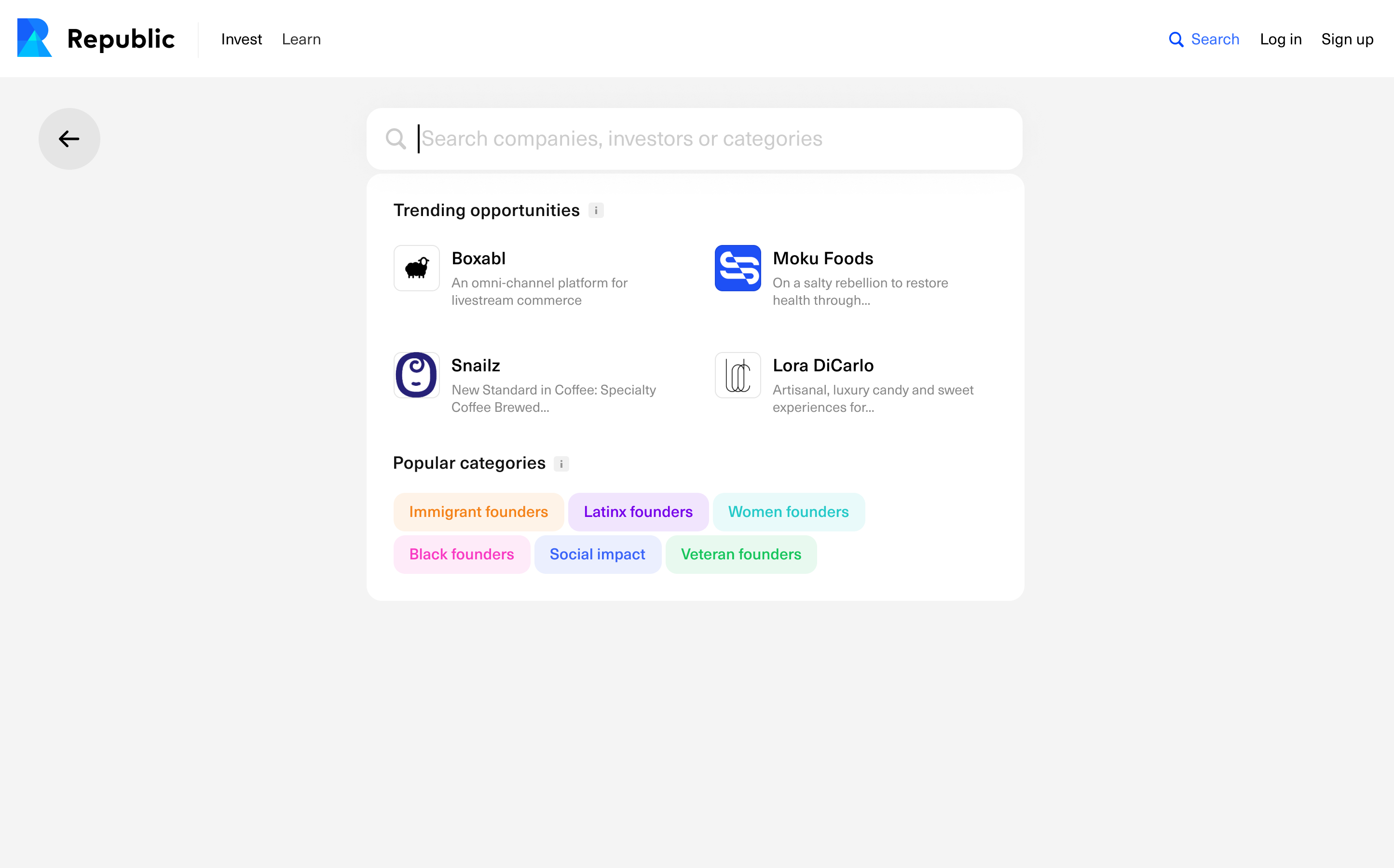
This past summer I worked at a start-up called Republic as a product/graphic design intern. Republic is a platform where everyone, not just accredited investors, can invest in start-ups.
I helped design a new search interface we call Global Search (Slide 1, Final Design). The existing search on Republic only allows users to search for companies by name and by adding certain filters like “Sector” and “Revenue” (Slide 2). We wanted to give users a way to not only be able to search companies but to also search for relevant categories and investors that may be interesting to them. Our overall goal was to make search more focused on discovery. My work mainly involved conducting internal user tests with prototypes I made in Figma and working with our lead designer to implement the feedback we received while making sure the designs aligned with our goal of increasing deal discovery with the implementation of Global Search.
One of our limitations was not being able to implement a search in the header of the website, so we came up with some other options that would have the search experience on a separate page. One option did not have the header after the user navigated to search for a more “focused search” experience (Slide 3). The 2nd option had the header and then had a large search bar, while also having big images for the companies displayed before you search (Slide 4). The 3rd option had the header and the search bar, but again was a bit more of a focused search experience, with smaller thumbnails for the companies (Slide 5). After some internal testing, we noticed most people were drawn to option 3 because they did not feel overwhelmed by information and visuals, and they could easily navigate to anywhere else on the Republic site from this option.
In this version we show trending opportunities (companies) and popular categories before a user starts typing because if a user is new or just doesn’t know what to search, this will provide them some options of what they can look for. When a user starts typing we will show the most relevant results within opportunities, categories and investors (Slide 9). When clicked on, the results will open in a new page, so the user can look at multiple results without losing their spot. If the user’s search does not return any results, we will show them the same opportunities and categories as before they searched and additionally allow them to fill out a form if for some reason our results did not return what they expected (Slide 10).